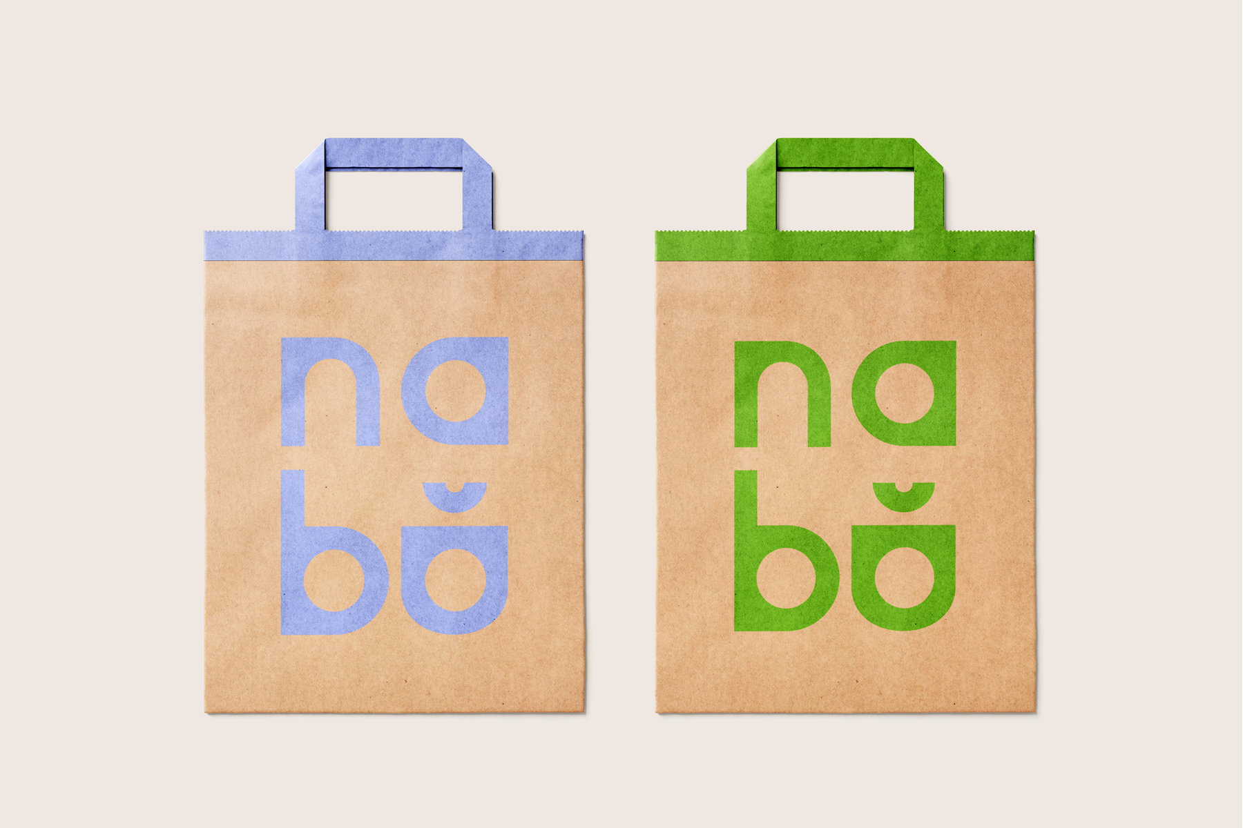
Commissioned to redesign the identity of NABO (Núcleo Apático das Brigadas do Ócio) - an independent publisher specialising in photography books and editorial experimentation.
This project answers the brief's core challenge: to strengthen the brand's visual presence without robbing it of its voice.
NABO is a publisher that is critical and contemporary, but also approachable and unpretentious. The new identity needed
to hold both of those things at once.
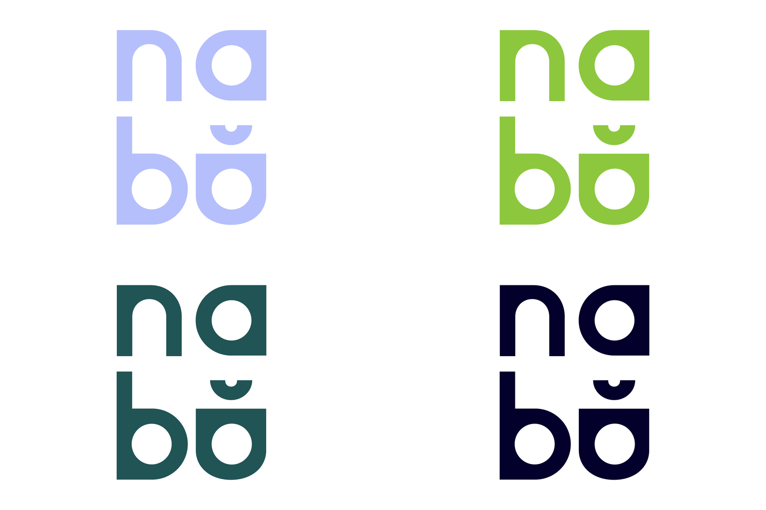
The solution is geometric and flexible. The logotype is constructed from bold, rounded forms that feel confident
but not rigid, and the system is built around adaptability -
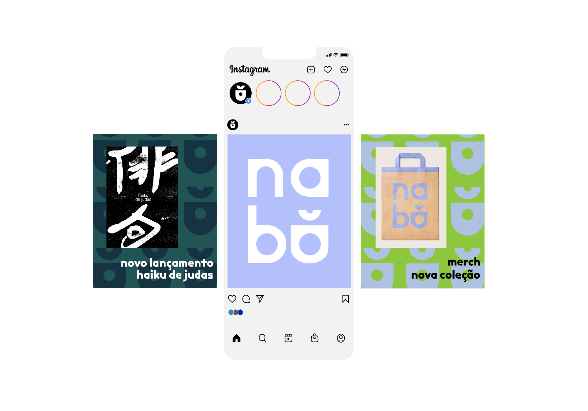
a generous colour palette and a modular geometric pattern
that can expand or contract depending on the context.
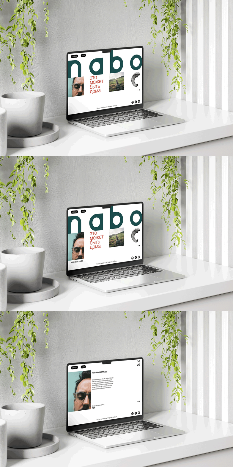
No single colour owns the brand; instead, the identity shifts between teal, green, lavender, navy and yellow-green, keeping the system alive and dynamic across Instagram, the website, physical bags, and print.
The result is a brand that feels like it belongs in the world of independent publishing: considered, playful, and entirely itself.